Knowing how the MDC people talked about Boeing, and how the Boeing people talked about MDC people, when we had to deal with Boeing when trying to sell them software, if those attitudes permeated up to the board level, I'd be shocked if there was any common board members. As for how many MDC people ended-up anywhere accept those military and aerospace divisions, I don't think it was all that many that ended-up in the commercial aircraft side of the business, at least not after they had shutdown the Long Beach non-military operation (note that they assembled C-17's in Long Beach, which originally did evolve out of their commercial operation). Besides, despite what the headlines might say, it was a merger in name only. In reality, it was a takeover. After all, when the dust settled, the name on all of the buildings was spelled
'B O E I N G'.
That being said, there was ONE thing that Boeing did retain from MDC, and it was something which, while it was rather minor in scope and importance, it was a very raw issue when it came to the Boeing people.
Over the years Boeing really never had a real 'logo' other than the name of the company. Granted, that had evolved over the years, but there was never anything graphical or symbolic which stuck in people's minds. McDonnell Douglas, on the other hand, always put a lot of effort and emphasis on it's logo. And so what happened was that after the 'merger', within a year or so, Boeing decided to publish and start using an actual logo, and guess what, it looked almost identical to the old MDC logo, which had been seen and recognized throughout the aerospace industry (including the commercial aircraft sector) for decades. As you can imagine, the old hard-line Boeing people were not happy with this.
The show you what I mean, here are some images that will demonstrate this.
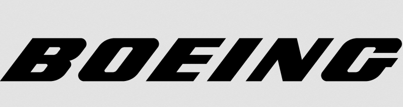
This was the Boeing logo before the 'merger':
This was the McDonnell Douglas logo prior to the 'merger':
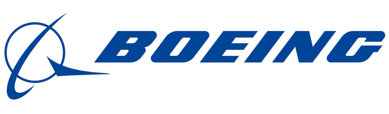
And this is what became the Boeing logo after the 'merger':
But the insult didn't end there. You see the symbolic portion of the McDonnell Douglas logo that they had been using for years, it was actually a modification of the old Douglas Aircraft logo.
This was the McDonnell Aircraft Company logo before the 1963 merger with Douglas Aircraft (which, when you look at the final company, was closer to a true merger):
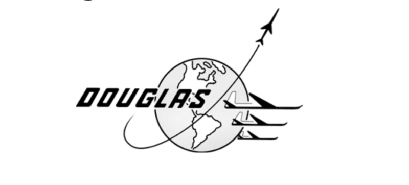
And this was the logo used by the Douglas Aircraft Company at the time:
So you can clearly see where the new McDonnell Douglas combined company got their inspiration when it came time to create a symbolic image for the company.
Now lets get back to that new Boeing logo. In reality, the symbolism which Boeing added to the logo of the new company was actually something that can be traced back to the old Douglas Aircraft Company, the company that the people at the commercial aircraft division of Boeing, which was the biggest part of the old Boeing, really considered to be their lifelong competitor, if not their arch enemy, and now every time they looked at the new Boeing logo they're being reminded of not only McDonnell Douglas, but of DOUGLAS AIRCRAFT.
John R. Baker, P.E. (ret)
Irvine, CA
Siemens PLM:
The secret of life is not finding someone to live with
It's finding someone you can't live without