Continue to Site

Eng-Tips is the largest engineering community on the Internet

Intelligent Work Forums for Engineering Professionals

  • Congratulations cowski on being selected by the Eng-Tips community for having the most helpful posts in the forums last week. Way to Go!

Visualizing the pressure around the head 3

Status
Not open for further replies.

Kimpan

Mechanical
May 30, 2008
39
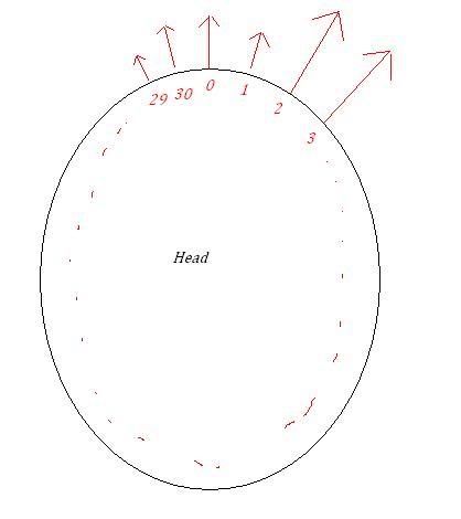
I have measured the pressure between the head and the helmet that arises when wearing a helmet, using pressure sensitive film. The purpose is to see how the pressure is distributed around the head. The film was applied to the head like a sweatband and is divided into a number of sensors that measures the pressure in real time. I have the values stored in an excel document and now I am thinking of ways to have them easily presentable. The sensors are numbered from 0-30 around the head with each sensor having a value in excell. something like this:
# KPa
0 5
1 4
2 10
3 10
.
.
.
29 3
30 8

Is there a way in Excel or some other program that lets you visualize in the following way where the length of the arrows represents the value at that point:
headpressure.jpg
 
Replies continue below

Recommended for you

Best way I can think of would be to assign a position to the tail of each arrow making a circle. Then add the pressure to the tail position (with proper x and y split for direction). Then, you could put in a linear trendline connecting the tail and head positions.

EXAMPLE assuming head radius of 1 used:
Sensor #1
Position: +45 deg from horizontal
Tail Position: cos(45deg), sin(45deg)
Head Position: Pressure*(cos(45deg))+cos(45deg), Press*sin(45deg)+sin(45deg)

Not a very elegant solution, but it might work...

Otherwise maybe a 3D graph, again creating a circle for the tail position and the pressure as the "Z" value, but that seems messy and probably not a good way to go...

Or maybe a "radar" graph? I've never used one in Excel, but I see it as an option... Maybe see what you can do with that (again creating a circle head and the pressure).

-- MechEng2005
 
There's a nice trick with xy graphs, a blank row effectively lifts the pen.

So all you need to do is plot the base ellipse, and then draw each arrow.

It'll take you a while to figure out how to do the latter.

There may be a clever solution using Draw commands and VBA to draw some arrows in specified locations.

Cheers

Greg Locock

SIG:please see FAQ731-376 for tips on how to make the best use of Eng-Tips.
 
You could try a Radar Plot, if your data can be manipulated so as to wrap around a full 360 degrees in uniformly spaced angular increments - see attached sample.

E.g. In my example, X-Axis range goes from 0 degrees to 355 degrees in 5 degree increments. Y-Axis range goes from 0 to 4. Create a Radar Plot, and then change the default scale of the radial axis to shift the Radar Plot out radially.

Hope this helps!
 
 http://files.engineering.com/getfile.aspx?folder=0acbacd0-f9c9-483b-96f2-063061636b43&file=Radar_Plot.xls
My first thought was to use VBA to draw the arrows. I have done this in the past, using VBA as a "CAD" program within Excel. It can be a very tedious process though and requires consideration of scaling, etc. For a one-off type plot it probably would not be efficient.
 
I went for the model posted by JulianHardy.
Thanks! works great.
 
Status
Not open for further replies.

Part and Inventory Search

Sponsor