Confused with a simple excel/graph issue
(OP)
Hi there, So to sum this up excel is confusing the hell out of me at the moment, I am attempting to make a P-v diagram in excel using a small amount of data recieved from a test. I will post what I am currently getting but basically all I need is for the graoh to plot point 1 at 0.001084 at 400kPa and point 2 at 0.01 at 2MPa, literally just showing a straight line but for some reason this is what I am getting and I have no idea why. Any help would appreciated. Pressur eon the x axis and volume on the y axis.
Update: I think I might have just fixed this by switching the data around so that volume is in the left column and pressure is on the right and just using the switch row/column button as I am now getting the correct graph.
RE: Confused with a simple excel/graph issue
TTFN (ta ta for now)
I can do absolutely anything. I'm an expert! https://www.youtube.com/watch?v=BKorP55Aqvg
FAQ731-376: Eng-Tips.com Forum Policies forum1529: Translation Assistance for Engineers Entire Forum list http://www.eng-tips.com/forumlist.cfm
RE: Confused with a simple excel/graph issue
Change the references to the X & Y values accordingly (easiest way is to DELETE the contents and click on the cells to create the series cell reference)
OK and vola!
Skip,
Just traded in my OLD subtlety...
for a NUance!
RE: Confused with a simple excel/graph issue
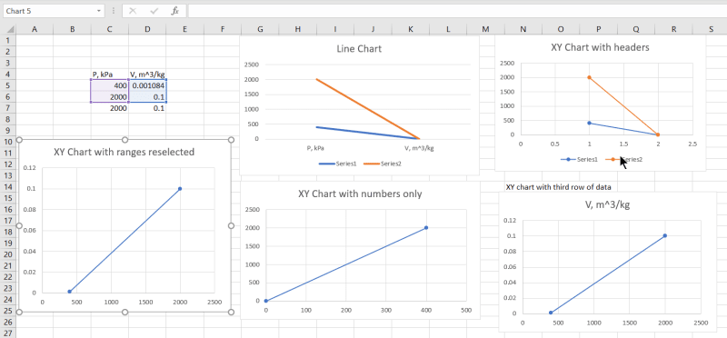
The top left graph was generated by selecting a "Line Chart" as the graph type, with range C4:D6 selected.
Top right had the same selected range, but I selected "Scatter (XY)" as the graph type. It has converted it into a Line Chart, but with the series names converted into sequence numbers (but with values displaying as decimals rather than integers!).
For lower middle I selected range C5:D6 and chose Scatter (XY). This has now plotted as an XY graph, but with the data in rows rather than columns.
For lower right I added an extra row of data and selected C5:D7 and Scatter. The data is now plotted correctly, but it has decided that the text in cell D4 is the graph title. There is actually no need to copy data into the third row. It works the same if the third selected row is blank.
For the lower left chart I selected C5:D6 and chose Scatter (XY), then reselected the data. If you don't select the header rows when you generate the chart it leaves it as an XY graph with one data series, and you can re-select by drag and drop, or through the select data menu (if you prefer).
Doug Jenkins
Interactive Design Services
http://newtonexcelbach.wordpress.com/
RE: Confused with a simple excel/graph issue
> if Excel sees any hint that the data is actually a "line graph" (i.e. the X values are not plotted to scale, but with equal spacing for each point), it will convert it to a line graph for you without asking
another thing that can cause this is when the values in the first column (x axis values) are formatted in such a way that excel is not sure whether they are numbers or text. sometimes this happens for imported data.
you can correct it if you know the intricate rules of number formatting, but sometimes I give up and use a workaround to make excel reformat it for me. I do this by building a copy of the data from the original using +0 on each cell. that forces excel to format it as a number without changing the value. the new block of data's will plot x-y fine. if you are have only values (no formulas), then you can copy/paste-special-values from that new block of data to overwrite your original data to reduce the clutter.
=====================================
(2B)+(2B)' ?
RE: Confused with a simple excel/graph issue
That's called a Category Axis.
Right click that axis and you can usually select a numeric option rather than text.
Skip,
Just traded in my OLD subtlety...
for a NUance!
RE: Confused with a simple excel/graph issue
TTFN (ta ta for now)
I can do absolutely anything. I'm an expert! https://www.youtube.com/watch?v=BKorP55Aqvg
FAQ731-376: Eng-Tips.com Forum Policies forum1529: Translation Assistance for Engineers Entire Forum list http://www.eng-tips.com/forumlist.cfm
RE: Confused with a simple excel/graph issue
The point is that when you include the headers in the selection the x-axis is automatically switched to a "category axis", even though that is not appropriate for an XY graph, and the numbers are already in numeric format, not text.
Doug Jenkins
Interactive Design Services
http://newtonexcelbach.wordpress.com/
RE: Confused with a simple excel/graph issue