Literally the first line of the findings summary:
Lancet Article said:
Across the 854 urban areas in Europe, we estimated an annual excess of 203 620 (empirical 95% CI 180 882–224 613) deaths attributed to cold and 20 173 (17 261–22 934) attributed to heat.
Makes it quite clear that the results of the study are that excess 'cold deaths' exceed excess 'heat deaths' by a factor of 10.
This is the description of the chart from the report - which basically just verbally describes the data presented, including maxima for age groups and heat/vs cold. Zero political interpretation. Zero intent to do anything other than just show the numbers..
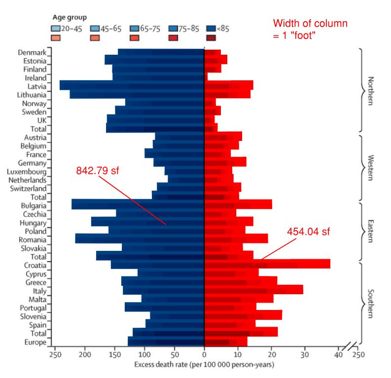
Lancet Article Again said:
Figure 3 shows the raw excess death rates broken down by age groups at the country level. For both cold and heat, the effect was noticeably larger for the oldest age group, with 82 (72 to 91) and seven (six to eight) excess deaths per 100 000 person-years. This excess represented around 60% of the total burden for both cold and heat. In contrast, there was around one death per 100 000 person-years in the youngest age group for cold, and less than one per 100 000 person-years for heat. The impact of cold is important everywhere, but is generally smaller in the western region and larger in the northern and eastern regions, with a maximum of 240 (151 to 327) raw excess deaths per 100 000 person-years due to cold in Latvia. There is wider heterogeneity in the effect of heat, which is low in the northern region, with the exception of Latvia and Lithuania, and much higher in the southern region, with a maximum of 37 (25 to 49) excess deaths per 100 000 person-years in Croatia.
bradrs said:
if you just look at the lines without looking at the scale. You see more red area than blue area
Literally not true. If this chart was presented with no scale at all, it still very clearly shows about double the area committed to excess 'cold deaths' as compared to 'heat deaths'.
This whole conversation is baffling to me. There is literally zero political influence in the context of this chart as presented in the report, and no intent to deceive by the authors.
In my opinion the only reason you would ever interpret that graphic in that way is if your personal point of view is so strongly biased against any scientific communication of climate-science-related-data that you believe nothing in the data can possibly be true. This is a case where bias is only there if you're determined for it to be.
I continue to be so disappointed in the culture of this forum.
This article contains a whole lot of interesting data - and that data would make a case for someone to argue about whether global warming actually means fewer excess deaths overall. That would be an interesting conversation where we could talk data. Like, you know, engineers.
Instead, out of the entire article, one chart gets quoted completely out of context and gets a bunch of political assignment assigned to it which pretty plainly isn't there when it's viewed in context.
Aren't we better than this? If not, shouldn't we be?