Continue to Site

Eng-Tips is the largest engineering community on the Internet

Intelligent Work Forums for Engineering Professionals

  • Congratulations KootK on being selected by the Eng-Tips community for having the most helpful posts in the forums last week. Way to Go!

Hysteresis Plot - Adding an Average 1

Status
Not open for further replies.

mattyjb88

Mechanical
Sep 15, 2010
12
Hello all
I have what I think is a basic question - here's hoping someone can point me in the right direction.

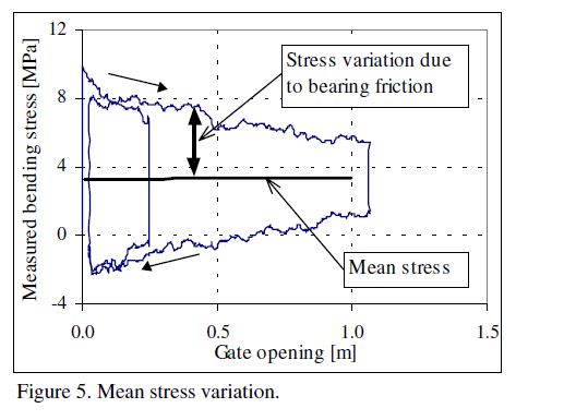
I am plotting stress measured by strain gauges against position for a piece of equipment. The stress follows a typical hysteresis curve. For my analysis I need to add a mean stress line against position. For the life of me I can't seem to get excel to produce something sensible. Any ideas would be great thanks.

Below is an example of what I am trying to achieve.
Mean_Stress_Example_emlqhw.jpg
 
Replies continue below

Recommended for you

Do you want a mean of all data? Or a mean line that varies with x value?

Can you attach a sample dataset?
 
You'll probably need to do it piecewise.

Break out the opening and closing curves into separate X-Y series.

For each small increment of gate opening find the stress points from each curve and "average" those; creating a new series. If your small increments are small enough a simple mean might be ok.

Excel's Data Analysis | Moving Average feature might be your friend here. I've never used it, so I'm not sure.
 
I suspect it is possible in Excel without using VBA but it won't be pretty. You could use histogram to bin all your data into subsets of gate opening (eg 0.1 wide bins) and then take the average of the positive ones+the average of the negative ones in each bin.

Perhaps less ugly would be to fit a regression curve to each segment of the time history.

Cheers

Greg Locock


New here? Try reading these, they might help FAQ731-376
 
I think AVERAGEIFS() will get the job done.

Maybe even with all the data in a single series.
 
Thanks Everyone for your ideas.
I gave the AVERAGEIFS() function a go, but it still gave a very variable plot which isn't ideal.

Attached is an example dataset as requested. Appreciate any further ideas.
[URL unfurl="true"]https://files.engineering.com/getfile.aspx?folder=2ccc52bb-6221-4011-907f-051b590aa797&file=Data_Sample.xlsx[/url]


At the moment I am just lining it up visually, but it would be useful to be able to compute the curve for future automated analysis.

Many thanks
 
Well, the data looks like what it looks like.

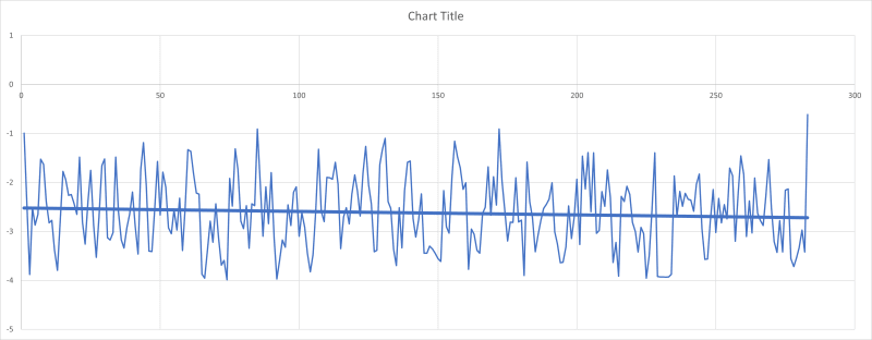
Here is averageifs() with a 1 mm bin and a linear trendline added to that.

Average_with_Trendline_e6rhik.png
 
MintJulep, I would be interested to see the formula you used. I found I had to use the AVERAGEIFS formula.
Edit - I just noticed you used AVERAGEIFS as well! It would still be good to see how you used it.

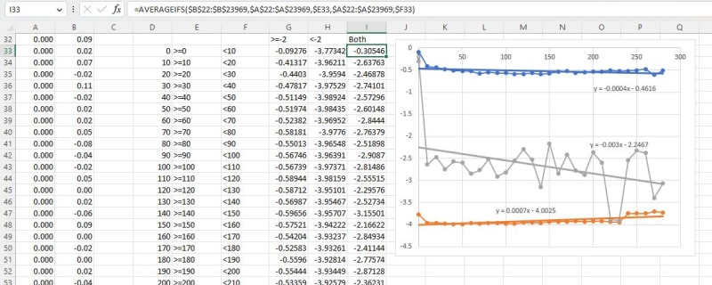
My procedure was (see screenshot below):

1. Create a column of bin ranges in Column D (I used a spacing of 10).
2. In columns E and F create text formulas defining each limit: =">="&D33 and ="<"&D34
3. Initially I thought the intention was to generate two lines for the upper and lower range of results, so I used:
=AVERAGEIFS($B$22:$B$23969,$B$22:$B$23969,">=-2",$A$22:$A$23969,$E33,$A$22:$A$23969,$F33)in Column G and
=AVERAGEIFS($B$22:$B$23969,$B$22:$B$23969,"<-2",$A$22:$A$23969,$E33,$A$22:$A$23969,$F33) in Column F
4. Checking the OP I saw that the intention was to average all the results, so there was no need for the ">=-2" or "<-2":
=AVERAGEIFS($B$22:$B$23969,$A$22:$A$23969,$E33,$A$22:$A$23969,$F33)

All the formulas can be entered in the top row and copied down as far as required.

TrendLines1-1_kx3myg.jpg


My spreadsheet is attached.

Doug Jenkins
Interactive Design Services
 
@Doug,
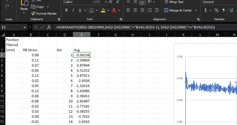
Looks like we used the same fundamental approach.
I did everything in the formula rather than using helper columns.

Screenshot_2023-02-21_091010_apyljg.png


Spreadsheet attached[URL unfurl="true"]https://res.cloudinary.com/engineering-com/raw/upload/v1676938363/tips/Data_Sample_dh4jmt.xlsx[/url]

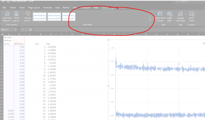
I'm not able to add the new series to the OP's original plot. Anytime I try Excel goes unresponsive while it tries to preview every possible style for the chart. Any idea how to get around that?
Screenshot_2023-02-21_091409_dm7lxf.png
 
Thanks MintJulep, I wasn't able to get the criteria working inside the Averageifs formula, maybe because I wasn't using VALUE().

I think I also had a problem with selecting the original graph. I'll have another look later.

Doug Jenkins
Interactive Design Services
 
I had another go at editing the original graph, and this time it worked!
TrendLines1-2_bjx5kk.jpg


I have added two lines:
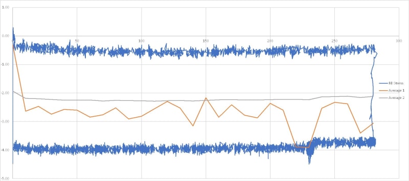
Average 1 is the average of all the data, divided into 10 unit wide bins. I think this is misleading because it seems there are many more data points on the lower line than on the upper, so the line is skewed downwards.

Average 2 is the average of the 2 lines (>= -2 and < -2), equally weighted. I guess the average of the average 2 line would be a reasonable estimate, or you could fit a straight line to it if required.


Doug Jenkins
Interactive Design Services
 
Status
Not open for further replies.

Part and Inventory Search

Sponsor