One little technique hint here, for what it's worth...
")
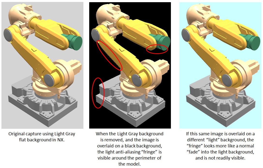
If you want the end result to look particularly good, choose an background color that is similar in light/dark tone to the new background on which you will paste the image.
That way, the anti-aliasing "fringe" around your model (the gradation from the solid color to the background color) will blend more naturally into your target background when you delete the background from the original image.
In other words, if your new (target) background is light in color, choose a light gray or white as the background color in NX when you do the screen shot (or rendering, if you're going larger):
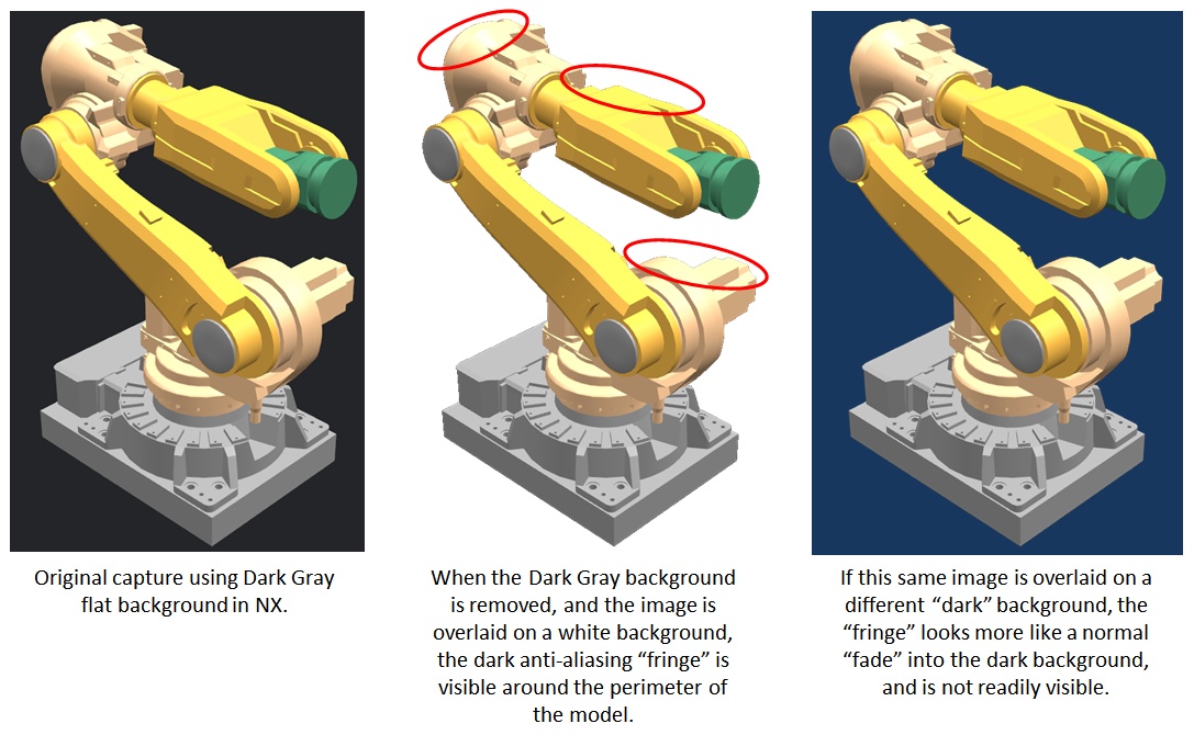
Or, if your new (target) background is very dark, choose a dark gray or black as the background color in NX before you do the screen shot:
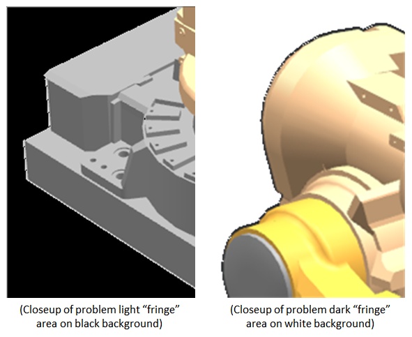
The effect is a bit subtle, but here are a couple of closeups from the middle "problem" examples above:
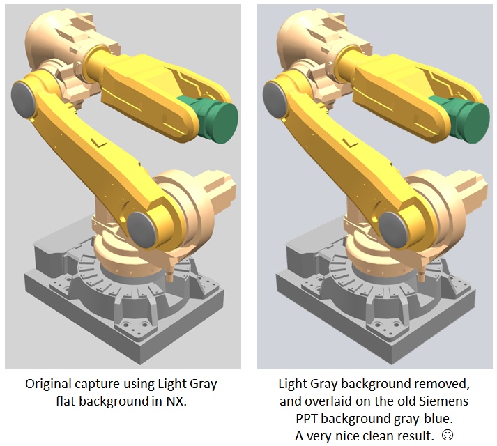
As another example, our old Siemens PowerPoint template had a light grayish-blue background color. When dropping images of NX models onto that background, I'd switch to the non-graduated gray background in NX before making the screen capture. It didn't have to match exactly, but getting in the ballpark first made the final look much better.
Does that make sense?
Taylor Anderson
NX Product Manager, Knowledge Reuse and NX Design
Product Engineering Software
Siemens Product Lifecycle Management Software Inc.
(Phoenix, Arizona)